🤖🖼 AI Art Blog ―To inspire AI to create paintings― 🅰🅸 🅰🆁🆃
A blog related to original AI artworks.
Color Fading and Its Mitigation by Negative Prompts
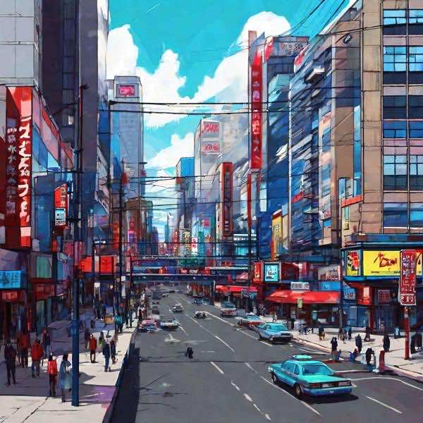
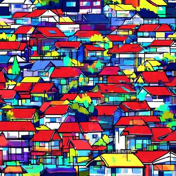
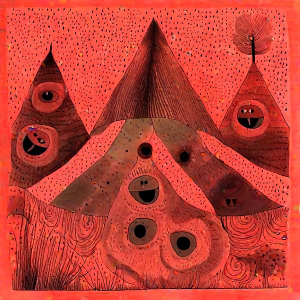
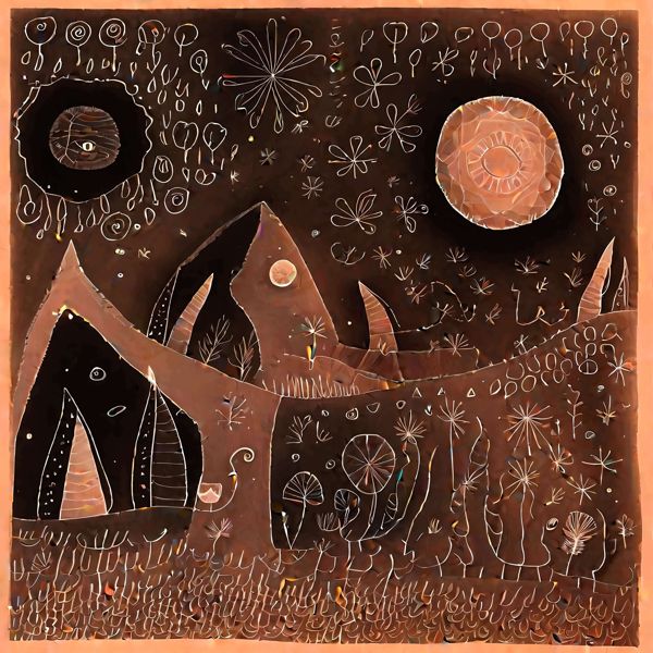
In Stable Diffusion XL, certain negative prompts can cause a degradation in the colors of the generated images. Yellow and green hues are significantly reduced, leaving predominantly red and blue tones. For instance, when using the creatorʼs name (Yasusi Kanada) as the positive prompt and “Arcimboldo” as the negative prompt, such color fading phenomena occur. Here are some examples:
Even with the presence of yellow and green, the overall color impression is not satisfactory.
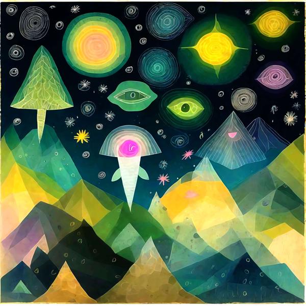
This “color fading” phenomenon may be attributed to the attempt to avoid the colors present in images generated with “Arcimboldo” as the positive prompt when it is specified as the negative prompt. To address this, it was hypothesized that providing color-neutralizing words along with “Arcimboldo” as the negative prompt might mitigate this phenomenon. Therefore, “monochrome” was specified, which seemed to significantly improve the color representation. However, it appeared to affect the patterns as well:
Subsequently, alternatives like “gray,” “grayscale,” and “grayish” were tested in place of “monochrome.” Here, “grayscale” is examined:
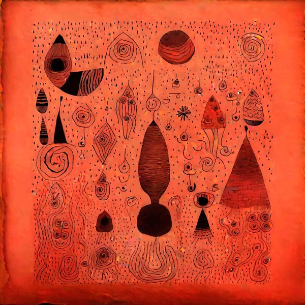
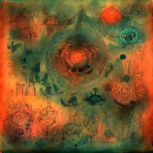
Both in terms of color improvement and pattern, “grayscale” appears to yield results similar to specifying “monochrome.” The effectiveness of “monochrome” or “grayscale” may vary depending on the positive prompt. If these wordsʼ effects are not suitable, other color-related terms can be explored. For example, specifying “red” as the negative prompt proved effective when the positive prompt was “Klee” and the negative prompt was "Mondrian.” Here are some examples:
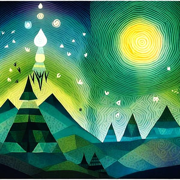
It is evident that there is a significant presence of red in many images. Hence, here are examples when “red” is specified:
In many images, there is a diversification of colors. However, the presence of red is significantly reduced.
Dasyn.com デイシン
Created: 2024-03-12 12:50 Edited: 2026-01-17


