🤖🖼 AI Art Blog ―To inspire AI to create paintings― 🅰🅸 🅰🆁🆃
A blog related to original AI artworks.
Chatting with ChatGPT-4o about a “collaboration” with Seurat
Chatting with ChatGPT-4o about art interpretations has led to various insights.
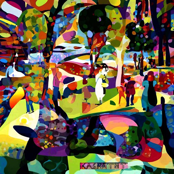
Q: Please provide an interpretation of this artwork (ci9s7Qlc), including any artists it might have been influenced by.
A: This artwork uses techniques like pointillism and abstract expression, creating a vibrant landscape with vivid colors. Fine dots and blocks of color are arranged throughout, merging to form an impressive landscape as a whole. Simplified silhouettes of people and tree shapes give it a bright, cheerful atmosphere.
Notably, it resembles Georges Seurat’s pointillism and the vibrant colors and bold forms of Henri Matisse’s Fauvism. Like Seurat, small color elements collectively shape the overall composition, enhancing its effect when viewed from a distance. Additionally, Matisse’s sensory use of color emphasizes color impressions over realistic depictions of the landscape.
Overall, while depicting a concrete landscape, it conveys abstract beauty through color and shape, providing a colorful visual experience that evokes sensory delight in viewers.
Q: Could you explain the strengths and weaknesses of the artwork above (ci9s7Qlc) in about 10 lines?
A: This artwork has several commendable aspects as well as areas for improvement.
Strengths- Vivid Colors and Harmony: Bold, vivid colors create a strong visual impact, with bright tones enhancing the enjoyment and vibrancy of the landscape.
- Complex Composition and Unity: The combination of pointillism and color blocks adds complexity, yet the artwork retains a cohesive feel. Viewing from a distance brings out the full image, captivating the viewer’s eye.
- Fusion of Impressionism and Abstract Expressionism: Influences from Georges Seurat’s pointillism and Henri Matisse’s Fauvism are evident, achieving a delicate balance between realism and abstraction. Although simplified, the forms effectively convey the landscape’s atmosphere.
- Unclear Visual Focus: The dispersed colorful elements make the visual focus somewhat unclear. Structuring the composition to naturally guide the viewer’s gaze could enhance the artwork’s impact.
- Lack of Contrast between Figures and Background: Silhouettes of figures blend into the background, reducing depth. Emphasizing the contrast between background and figures would enhance the overall sense of depth.
- Detail Adjustment: While the colors are beautiful, some areas feel slightly flat. Adjusting details would add tension and make the artwork feel more refined.
This piece is very appealing in terms of color and composition, though improvements could be made regarding visual focus and depth. Enhancing visual guidance while retaining the color richness would make it even more striking.
Q: What do you think is depicted in the lower part of the artwork above (ci9s7Qlc)?
A: The lower part of this painting uses abstract shapes and colors, intentionally vague in representation, but it may symbolize elements like “water” or a “pond.” The blending of blue, green, and purple colors suggests reflections, resembling the shimmer of a water surface. The combination of dots and color blocks may also reflect the faint shapes of trees and people mirrored on the water.
Through this abstract expression, the artwork offers various interpretative possibilities, creating an atmosphere where reality and fantasy intersect.
Q: To me, it looks like a cow lying down. What do you think?
A: Now that you mention it, it does indeed look like “a cow lying down.” The rounded shapes and color distribution might vaguely outline the cow’s body. The dark sections in black and purple resemble the back and legs of a cow, while the contrast with the green and yellow background evokes a relaxed cow in a pastoral setting.
Abstract artworks like this allow for varied interpretations by viewers. Your unique perspective brings a new story or scene to life within the painting.
Q: Even if it’s not a cow, given that the other elements depict people or trees, wouldn’t it make sense for the lower part to also depict something concrete?
You’re right; since this artwork includes concrete elements like people and trees elsewhere, the lower section might also represent something specific. With a concrete interpretation, here are some possibilities:
- Ground or Grass: It could represent the ground or grass where the figures are standing. The vibrant colors could be interpreted as textured soil or grass under the effect of light and shadow.
- Animal (such as a cow or horse): The interpretation of “a cow lying down” could indeed be valid, aligned with the other concrete elements. It might depict an animal lying in the shade or on the grass, blending with the surrounding scenery.
- Waterfront or Pond: Including the previous interpretation, it could concretely represent a “pond” or “waterfront.” If viewed as a reflective water surface, it ties into the concrete elements of the overall scene.
In this way, the lower part of the painting might also represent a concrete subject. The appeal of this artwork lies in its openness to multiple interpretations, offering a multi-layered visual experience.
Dasyn.com デイシン
Created: 2024-11-06 00:00 Edited: 2026-01-17
